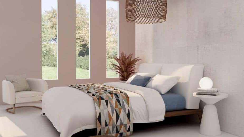
When designing a home or workspace, choosing the best color schemes for interior design is essential. Colors significantly influence the atmosphere of a room and its personality. Selecting the ideal palette and the best color combinations should not be overlooked or simply follow fleeting trends. Pantone color palettes, for example, follow seasonal trends, while interior design colors are meant to last over time. The relationship between trending shades and the ones proposed to the client must therefore be approached with more nuance. It is also necessary to consider the basic principles of color theory and the rules for matching colors effectively based on the desired effect.
Color Theory: Itten’s Wheel and Basic Combinations
Itten’s color wheel, inspired by Newton’s circle, is the main reference for understanding how colors interact. It consists of:
● Primary colors: red, blue, yellow.
● Secondary colors: orange, green, violet.
● Tertiary colors: obtained from combining primary and secondary colors.
The chromatic schemes derived from this structure are three:
● Monochromatic: based on a single hue with variations in brightness.
● Analogous: combining colors that are close to one another on the wheel.
● Complementary: pairing opposite colors to create bold contrasts.

Warm and Cool Colors: Their Impact on Spatial Perception
The distinction between warm and cool colors is essential during the design phase:
● Warm colors (from yellow to red) communicate energy, warmth, and visually reduce spaces.
● Cool colors (from green to violet) convey calmness, depth, and visually expand spaces.
The distinction between warm and cool colors is essential during the design phase:
The 60-30-10 Rule: Balancing Color Accents
One of the most well-known rules in interior design color schemes is the 60-30-10 formula, which refers to the percentage of color to use. According to this rule:
● The main color should cover 60% of the space. This is typically the best choice for walls, floors, and some furnishings.
● The secondary color should represent 30% of the color scheme. It is ideal as a contrasting shade, half as saturated as the main color, to create a sense of depth.
● The accent color is used for the remaining 10% and highlights contrast and the chosen chromatic combination. It is ideal for decorative objects, details, and accessories.
The distinction between warm and cool colors is essential during the design phase:
How to Match Colors at Home Using Interior Design Principles
To find the best color combinations for interior décor, it is important to consider the characteristics of the space, the style, and the atmosphere you want to create. Colors can deeply transform the final effect of a proposal, so during the design phase these factors must be clearly defined.
Structural Characteristics for Matching Colors in the Home
Colors can make a room appear more or less spacious and deep. For a low ceiling, for example, a light ceiling will create more breathing room, while a dark tone helps balance very high ceilings. Likewise, warm and dark colors work well on the side walls of excessively wide rooms, while cool and light shades make spaces feel larger. Another factor to consider is the natural lighting of the room, to avoid choosing a color that diminishes or excessively amplifies it.
How Style Influences Color Matching at Home
Each interior design style suggests certain tones and color combinations. Ethnic style requires warm, vibrant colors, while shabby chic is characterized by pastel tones such as light blue, lavender, or sage. Many neutral colors like beige, ivory, and white are ideal for both classic and modern styles because they promote intimacy and relaxation. However, color combinations in contemporary interiors differ from those of classical ones, especially when choosing an intense color. Fuchsia, acid green, and red are more suitable for modern environments, while burgundy and sage can complement even a classic style.
Interior Colors: Enhancing Every Room in the Home
According to chromotherapy, each color has a different effect on the mind. This is why it is essential to consider the purpose of the room being designed and the atmosphere the colors will convey. If green and blue have a regenerating and calming effect, yellow provides energy and orange enhances concentration. Red embodies passion and intensity, while white inspires peaceful purity and violet encourages introspection. Naturally, the color palette for the living room will differ from that of an office, kitchen, or bedroom.
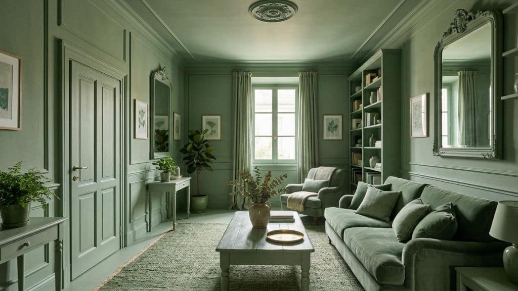
Matching Colors in the Kitchen
In the kitchen, colors should convey order and practicality without sacrificing style. Neutral and bright tones, such as white and light gray, help create a sense of space and make the room feel larger. For a more personal touch, color accents can be added to walls, chairs, or accessories: sage green and blue are excellent choices for a modern look, while natural wood warms the environment and makes it inviting. The key is finding a balance between surfaces and details, to create a functional and pleasant kitchen for everyday living.
Matching Colors in the Bedroom
The bedroom is dedicated to rest, so colors should promote calm and relaxation. Soft tones such as light blue, sage green, or lavender are ideal for creating a peaceful atmosphere, while neutrals—from beige to light gray—provide a balanced base that’s easy to coordinate. Those who prefer warmer touches can choose shades of pink or peach, paired with white or natural wood for a cozy environment. It is important to maintain consistency between walls, textiles, and furnishings to create a harmonious room that encourages restful sleep.
Matching Colors in the Bathroom
In the bathroom, colors play a key role in creating a relaxing and functional environment. Light tones such as white, beige, or pearl gray are ideal for visually expanding the space and conveying cleanliness. Those wanting a more modern style can choose strong contrasts, such as black and white, or opt for shades of blue and green that evoke water and freshness. Small colorful details in accessories or decorative tiles add personality without overwhelming the room.
Color Schemes for Interior Design: How to Combine Tones
Studying color in interior design helps enhance spaces and create proposals aligned with the client’s preferences. Depending on the desired effect, some of the best color schemes include:
● Monochromatic: ideal for harmonizing spaces with irregular structures and for creating a subtle, elegant impression. Starting from a single tone, variations of saturation and brightness are used. The final effect is a clean and unified gradient.
● Analogous colors: also called harmonious colors, these are adjacent on the color wheel. In this case, it is best to choose one dominant color, one adjacent shade as support, and the last for small details. This solution creates refined and harmonious environments, ideal even for classic styles.
● Complementary colors: opposite on the color wheel, such as yellow and violet, blue and orange, green and red. Choosing this scheme requires great sensitivity to ensure the result is pleasant. A third accent color can be added, for example in accessories. Because the contrast between complementary colors is strong, if the effect is too intense, it can be softened by adjusting the intensity or value of the chosen tones.

Matching Colors in Interior Design with ArredoCAD
A 3D design software like ArredoCAD Designer is an excellent tool for experimenting with different color schemes in interior design projects. Thanks to fast 3D previews, you can immediately see the final effect of each combination. You can modify the color of floors, walls, wallpapers, and other details to present multiple variations. The rendering speed and presentation features also make it ideal for showing proposals to clients and agreeing on palettes and combinations. This way, you can immediately convey how the interior spaces will look once the chosen colors are applied. Learn more about ArredoCAD Designer’s interior design tools or explore our training courses in Interior Design.
Do you want to create professional moodboards and instantly transform them into photorealistic renders? Discover the full potential of ArredoCAD and request a free demo.
Visit our news section to stay updated on the latest trends.