Color drenching is one of the boldest and most captivating trends in contemporary interior design. Literally meaning “to flood with color,” this technique involves using a single shade—or very similar shades—to cover every surface in a room: walls, ceilings, doors, baseboards, furniture, and accessories. The result is an enveloping, cohesive space brimming with personality, where color ceases to be a backdrop and becomes the absolute star.
Let’s take a closer look at what it is, where it comes from, and how to use it thoughtfully in your spaces!
What is color drenching?
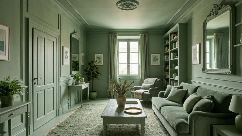
Color drenching is an interior design technique that involves applying a single color—in its various shades and finishes—to all the surfaces in a room. Walls, ceilings, doors, baseboards, radiators, and, in some cases, even furniture: everything is enveloped in the same shade, creating an immersive and visually cohesive effect.
Unlike a simple monochromatic scheme, color drenching isn’t limited to the walls. The goal is to eliminate any visual interruptions, transforming the space into a complete sensory experience. Color isn’t simply “applied” to the room: the room becomes the color.
The term “color-drenched” refers to the final result of this technique: a space saturated with color, where every element contributes to the overall chromatic harmony. Walls, windows, and architectural details all speak the same visual language.
A Brief History of Color Drenching
Although color drenching has only gone viral in recent years, its roots run much deeper in the history of design. As early as the modernist movement of the early 20th century, designers sought a chromatic unity capable of bringing order and meaning to a space. In the postwar period, Scandinavian and Japanese design embraced uniform color as a symbol of visual clarity and formal discipline.
In the 1970s and 1980s, the bold use of color made a comeback in the most daring interior design projects. Today, color drenching has become an emotional strategy: a conscious stylistic choice, but also a way to visually “embrace” a space and let it envelop you. 2026 is shaping up to be the year of monochromatic interiors, driven by a desire for more intimate, personal spaces that offer a respite from the visual chaos of everyday life.
Why choose color drenching?
Color drenching isn’t just a trend: there are very practical functional reasons behind these aesthetic choices.
The first concerns the perception of space. In small rooms, using a single color eliminates visual breaks between the wall and ceiling, and between the door and its frame, making the space appear more fluid and spacious without the need for structural changes. There is also a significant emotional component. Colors influence mood, and color drenching takes full advantage of this quality: sage green relaxes, deep blue focuses, and terracotta warms. Applying a shade throughout the space amplifies its psychological effect compared to using it sparingly.
Read our article to learn more about how to make your home even cozier!
Finally, in a monochromatic setting, the eye is no longer distracted by color variations and begins to focus on the materials themselves: the weave of a fabric, the grain of wood, the smoothness of a lacquered surface. The uniform color serves as a neutral backdrop that enhances textures and materials, making each finish the star of the show. And paradoxically, using a single color also simplifies design choices: once the right shade is identified, the risk of mismatched combinations is eliminated.
When to use color drenching
Color drenching works in many contexts, but there are certain situations where it is particularly effective.
In small rooms, such as bathrooms, entryways, hallways, or pantries, using a single color throughout is one of the most effective ways to make the space appear larger. Painting the walls, ceiling, and doors the same color makes the room’s boundaries “disappear.”
Even in large spaces, using dark or deep colors creates a “cocoon” effect: the room becomes intimate, enveloping, and almost theatrical. Perfect for studies, libraries, and living rooms designed for relaxation.
If a room lacks interesting architectural features, color drenching can completely transform it without costly renovations. A bold color applied throughout the space creates a sense of identity where none existed before. Painting walls, baseboards, doors, and moldings the same color helps conceal imperfections, uneven surfaces, and less-than-ideal architectural details, giving the room a more polished and uniform look.
Where to use color drenching
Entrance and hallway
It’s the perfect starting point for experimenting. High-traffic areas, which often lack natural light, are transformed with bold shades like bottle green, midnight blue, or terracotta. Painting walls, doors, trim, and floors in the same color creates a striking effect the moment you walk through the door.
Living room
In the living room, color drenching works best with warm, earthy tones—such as ochre, sand, and rust—or with deep neutrals like charcoal gray and off-white. The key is to balance the solid color with natural materials: wood, stone, and soft fabrics that add texture and warmth.
Kitchen
A color-drenched kitchen is a bold and striking design choice. The key is to choose a shade that complements the materials of the countertops and doesn’t overwhelm the space. Sage green, midnight blue, or cream white are very versatile options.
Bedroom
The bedroom is perhaps the ideal room for colour drenching. A uniform colour envelops the space and creates that sense of sanctuary that promotes rest. The ideal shades are cool, muted tones: greyish blues, deep greens and soft lilacs.
Bathroom
In the bathroom, colour-blocking is particularly effective because the spaces are often small. Walls, floors, shower enclosures and sanitaryware in coordinated shades create a luxurious and polished look. Sage green, petrol blue and dusty pinks are very popular.

What is the drenching pattern?
The drenching pattern is a decorative variation on colour drenching. Instead of using a single colour, the same decorative motif is applied in an immersive and obsessive manner across all surfaces: walls, furniture, textiles, ceilings and floors. Whether floral, geometric, striped or optical, the chosen design is replicated everywhere, creating a total, theatrical and highly stylised effect.
This can be achieved using wallpaper, decorative stencils or advanced painting techniques. The secret lies in balancing the intensity of the pattern, its scale and the colour palette: a pattern that is too large or too saturated can make a room feel overwhelming. Conversely, a subtle pattern applied consistently across all surfaces creates depth and charm without being overwhelming.
The drenching pattern is particularly suitable for high-traffic areas, entrance halls, corridors and guest bathrooms, where its striking visual impact can be fully appreciated without becoming overwhelming during prolonged use.
Ideas for designing monochromatic interiors
A few practical starting points for those who want to give it a go:
- A head-to-toe sage green look: walls, doors, skirting boards and storage units all in the same shade. Perfect for a bedroom or bathroom.
- Terracotta in the hallway: a warm, inviting shade that adds character from the moment you step inside.
- Midnight blue for the study: it promotes concentration and creates a sense of depth. Pair it with brass or natural elements.
- Dove grey in the living room: neutral, sophisticated, timeless. It complements any material and style of furniture.
- Powder pink for the bedroom: a soft, subtle shade that creates a dreamy, cosy atmosphere.
View colour drenching with ArredoCAD
Before buying dozens of litres of paint and painting every surface in the room, it is essential to visualise the end result. Applying a colour to a small sample board is very different from seeing that shade covering the walls, ceiling, doors and furniture of an entire room.
This is where ArredoCAD Designer comes in.
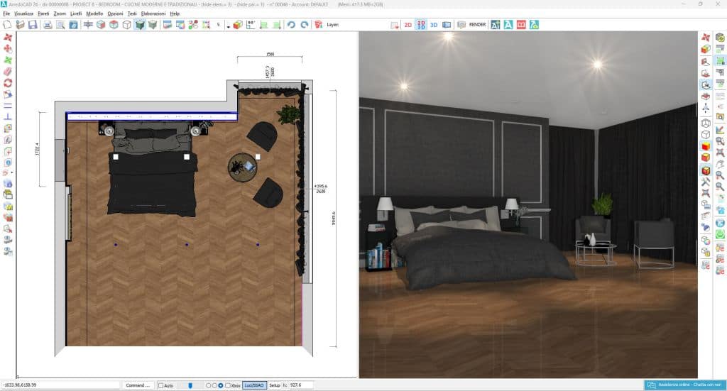
With ArredoCAD, you can assign colours and finishes to every element in the room and get a photorealistic preview thanks to the physics-based rendering engine, which accurately calculates how light interacts with the chosen shade. You can compare multiple colour options in just a few clicks, manage differences in finishes—matt, satin, gloss—between one surface and another, and share the proposal with the client before you’ve even bought a litre of paint. A tangible benefit that reduces second thoughts and makes the decision-making process more confident for everyone.
Practical tips for successful colour drenching
A few practical tips before we begin:
- Choose your colour carefully: always assess the shade at different times of day, in both natural and artificial light. A colour can look very different depending on the lighting.
- Start with the architectural surfaces: walls, ceilings, doors and skirting boards should be your top priority. Only then should you move on to furniture and accessories.
- Play with textures, not colours: in a monochrome setting, it is the variety of materials – wood, metal, fabric and ceramics – that adds depth and visual interest.
- Don’t forget the lighting: in colour-rich rooms with dark tones, good artificial lighting is essential. LED spotlights, wall lights and decorative lamps can make all the difference.
- Balance with natural elements: in rooms with very rich colours, elements such as natural wood, plants, stone or neutral fabrics help to balance the intensity of the colours and add warmth.
- Plan before you paint: use 3D design software such as ArredoCAD to visualise the result before you start. Changing a colour on screen is much easier than repainting a room.
Colour schemes and interior design
Colour drenching is much more than just a trend: it is a design approach that requires intention, consistency and vision. Choosing a single colour for an entire room means making a conscious style statement, creating a specific atmosphere and giving the interior a strong, recognisable identity.
For interior designers, architects and furniture retailers, tools such as ArredoCAD make this process more reliable and effective. The ability to visualise every colour option in 3D, with accurate lighting simulation, transforms a bold idea into a concrete proposal that can be verified and shared with the client before a single litre of paint has even been purchased. Visit our news section and don’t miss out on the latest updates!