
When designing a house or a workplace, it is fundamental to choose the best color schemes for interior design. Colors have a strong influence on determining the atmosphere and the personality of a space. Your choice of the ideal palette and of the best color combinations cannot be taken lightly or simply follow the latest trends. Pantone’s color palettes, for example, follow a seasonal trend, while the colors used in interior design are destined to last over time. Thus, the relationship between the most popular tones and your proposals to your clients will have to be more subtle. Furthermore, you will have to keep in mind the principles of color theory and therules for combining colors in the best possible way depending on the desired effect.
The Importance of Color Theory in Interior Design.
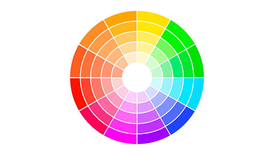
Color theory identifies three primary colors and three secondary colors. The former – red, blue, and yellow – cannot be obtained by mixing other colors. The latter – orange, green, and purple – are obtained by mixing equal parts of two primary colors. If you mix the primary colors with the secondary colors, you obtain another six colors, the tertiary colors, which together with all the others form the Color Wheel, as theorized by Isaac Newton. This wheel is an excellent instrument to begin choosing color combinations. Aside from this scheme, colors may also be divided into:
● Warm colors: these are the colors that go from purple to red and convey a sensation of heat while giving the impression of drawing closer to the viewer.
● Cool colors: these are the colors ranging from purple to green and yellow, which convey a sensation of coolness and distance from the viewer.
Color schemes for interior design must bear in mind these categorizations as well as other essential features of color. Among these, saturation – i.e. the greater or lesser intensity of the color – and value, which refers to its level of luminosity.
How to Choose Colors for Interior Design.
To find the best color combinations for furnishing a space, it is important to bear in mind its main features, as well as the style and the atmosphere you are looking to create. Colors are capable of deeply influencing the final effect of a proposal, thus when designing you should keep in mind:
Structural Features.
Colors can make a space look bigger or smaller. When dealing with a space with a low ceiling, for example, painting the ceiling itself a light color will make for a feeling of greater height, while a darker tone may be useful when dealing with very high ceilings. Similarly, dark, warm colors are suited for the walls of spaces that are exceedingly vast, while light, cool hues can give a feeling of greater size. Another aspect you should consider is the natural lighting of the space, as the wrong color can excessively diminish or increase it.
Style.
Each interior design style suggests a set of colors and combinations. An ethnic style calls for warm, bright colors, while shabby chic goes for pastel colors such as light blue, lavender, or sage. Neutral colors, such as beige, ivory, and white are ideal both for a classical or a modern style, as they make for greater intimacy and relaxation. However, contemporary interior color combinations differ from the classical mainly in the choice of intense colors. For example, fuchsia, acid green, and red are more suited for modern locations, while burgundy and sage go well even with a more classical style.
Purpose.
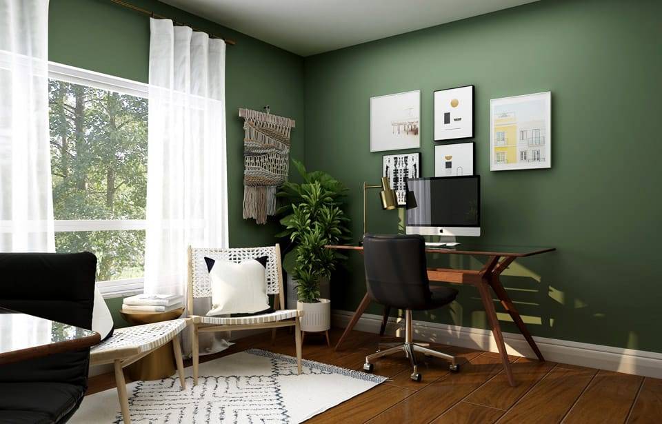
According to chromotherapy, every color has a different effect on your psyche. For this reason, it is of the utmost importance to take into consideration the use to which the space you need to furnish will be put and the atmosphere the colors will create. While green and blue have a regenerating and soothing effect, yellow is energizing and orange favors concentration. Red is the color of passion and of aggressiveness, while white inspires peace and purity, and purple favors introspection. It is thus evident that the color palette for the living room will be different from the one you choose for the studio, the kitchen, or the bedrooms.
Color Schemes for Interior Design: How to Combine Hues.
Studying the color schemes for an interior design project makes it possible to get the best out of every space and produce ideas that are suited to the client’s taste. Based on the effect you are looking for, you can choose among some of the best color schemes for a pleasant effect:
Monochromatic.
This color scheme is quite suited tobring harmony to spaces with an irregular structure or to convey an impression of sober elegance. Starting from a single tone, you can vary the saturation and brightness. The final effect will be a pleasant, clean, uniform tapering down.
Analogous Colors.
Analogous or harmonic colors are the ones closest to one another on the Color Wheel. In this case, it is best to choose a dominant color to combine with one of its adjacent colors for support and for the tinier details. This solution makes for refined and harmonious spaces and is ideal even with a classic style.
Complementary Colors.
Complementary colors sit opposite to one another on the Color Wheel, such as yellow and purple, blue and orange, green and red. Choosing this color scheme requires great sensitivity for the result to be pleasant. You can add a third color to the two complementary colors as an accent, for example using it for ornaments and decorative elements. The contrast between complementary colors is very strong. If you don’t find the effect convincing, you can tone it down by varying the intensity or the value of the colors you have chosen.
The 60-30-10 Rule: A Balanced Combination of Colors.
One of the best-known rules when it comes to color schemes for interior design is the 60-30-10 rule, which refers to the percentage of color you should use:
● The main color should cover 60% of the surface. This is, for example, the color you choose for the walls, the floors, and some pieces of furniture.
● The secondary color should make up 30% of the color scheme. It is perfect for a contrasting color, half as saturated as the main color to create a sense of depth.
● The accent color should be used for 10% of the surface and it should enhance the contrast or the color combination you have chosen. It is ideal for decorative objects, details, and ornaments.
Combining Colors for Interior Design Using ArredoCAD.
A 3D design software such as ArredoCAD Designer is an excellent instrument to experiment with different color schemes when you are working on an interior design project. Thanks to its speed in creating a 3D preview, you will immediately be able to observe the final effect of the combination you have chosen. You will be able to change the color of floors, walls, wallpaper, and other details so as to present your clients with a variety of options. rendering speed and presentation tools also make it ideal for presenting your project to your clients and to work on palette and combinations together. In this manner, you will immediately convey a clear idea of what the space will look like once the color combinations you have chosen are applied.
Find out more about ArredoCAD Designer tools for interior design or about our Interior Design training courses.