
Getting to know the new trendy colors of 2020 for the interior design sector is like taking a journey through a fascinating kaleidoscope, into modernity and nostalgia, the past and present. Different shades of pastel mix harmoniously to create surrealist and futuristic effects, yet familiar and cozy.
This is the new fascinating trend launched by Pantone where metal and pastel colors are the leitmotiv for interior design 2020. We could safely say that this trend is indeed inspired by themes and initiatives in line with recent vast environmental awareness movements and that when it comes to interior design, nature plays a vital role in influencing the choice of trendy colors for 2020.
With nature being the source of inspiration, open spaces like the sky, the earth and the sea with warm and reassuring nuances, mirror the growing need of self-discovery and represent imaginary and perceived safe places that strengthen pleasant feelings and wellbeing.
Close attention is also payed to the element of steel on spaces with big windows such as ultra-modern buildings and their reflections of warm and cheering light, details which inspired Pantone to create a palette called Metropolis, dedicated to the urban style with metallic reflections and their delicate lavender nuances.
The palette called Trekking attracts nature lovers who like soft earth undertones and shades of mustard, like a walk on a mountain path.
Blue shades are among the protagonists as well this year, where one can navigate through thousands. The palette Prints Charming is dedicated to the romantics and the dreamers that love to be enchanted by fairy tale light blue tones, whereas the palette Beyond the pale is more on the classic side, emphasizing pastel colors all the way to shades of electric blue.
On this note Sherwin-Williams, one of the largest paint manufacturers in the US, consulted 265 interior designers before disclosing their own position regarding colors and trends for 2020. NO to the total white and NO to antique pink, this was their verdict and that’s indeed good news!
Color trend for decor
So, the new palettes follow the principles of the pursuit of serenity, in a way overthrowing the desire to be in the spotlight, rather replaced by the desire to feel emerged in and surrounded by nature, feeling connected in a harmonious way and as part of nature. The rediscovery of nature with its reassuring tones in the continuous changing of seasons does not leave much space for any gray or shades of gray.
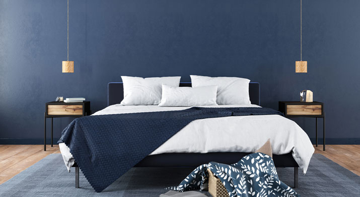
On the contrary, shades of light blue and in particular navy blue are the new protagonists. A fairly high number of interior designers think that this is the most relaxing color of all, versatile and flexible, thanks to the possibility of being combined with luxury finishing as well as with a more casual style. There is a clear desire to convey daily lived spaces and give them a further daring, a “human touch” where color is transformed into a vivid experience.
Sherwin-Williams has given a thought to styles of young houses where the new generation want to express their desire to dare and to be free. Mirrored in the orange and yellow shades, complemented with violet and unfailing blue tones. Black is present too, this neutral color with its numerous shades and nuances, that can be used anywhere when combined to bold colors. Dark and bold colors: this is the new home concept among the younger generation where living with color is wonderful.
- 2020: the winner is ...
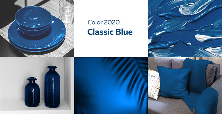
This year, awarded by Pantone as the best color of the year, Classic Blue is the winner. Warm and elegant, as reassuring as the blue of the night, this color has surely been valued as a classical beauty. Sherwin-Williams has also awarded the winning golden medal as the best color of 2020 to Naval SW6244, a wonderful deep blue. These two big groups, coincidently have chosen the same color that stands for harmony and emotional balance in chromotherapy, in line with the new trends in which the house is a reassuring nest where one feels protected. Needless to say that blue can harmoniously be combined with other favorite colors for this year such as trendy combinations with beige nuances, striped wall paper (navy style) and marble types. Blue can be a timeless and regal color, yet a fresh and cheeky one. What’s important is to find a balance between tones and styles. Even when used on one side of the wall, blue can change the essence of a space.
Best color matches for decor
Think green
- Choosing green shades brings you closer to nature and gives you a deep inner peace in any of its hues. Olive green, sage green, petrol green and water green are some favorites among the 50 variants and nuances of green. Its nature of a secondary color, mixing the primary colors of yellow and blue, makes green an unstable color, yet particularly noble and elegant. It can be combined with all earth shades, even with champagne ones, which are currently very trendy. It is wonderful with marble tones and country chic wall papers.
Over the rainbow
- Interior design trends for 2020, bring some other colors into the picture among the protagonists for home decorations. Champagne with its bronze or gold nuances is going to entirely substitute grey, creating a warm tone that recalls the sweet wandering and warmth of earth tones. It surely is a trendy color this year that can be combined with fabrics or design items in a classical and original way.
An elegant and particularly fine touch is given by the combination with dark red: color of the year in 2019 according to Sherwin-Williams, and still among the first 3 top colors in 2020 thanks to its versatility.
If you want to be daring, to be amusing and to convey energy, mango is the right color to paint a wall in your house. It’s a fun and warm color able to create a cozy atmosphere also used for cushions, curtains or lamps, even an entirely painted wall: an explosion of vitality.
Dark colors have enjoyed success this year too: carbon or iron tones as well as black are timeless due to their elegance. These colors are still worthy of space and representation in your house.
Previews of interiors – ArredoCAD is the right solution
Among the endless tones and shades produced by the largest paint manufacturers in the world, how can the right colors for your home be selected? How easy is it to understand if they are the best ones to be combined with the already existing furniture? How will they really meet your desires? How sure can you be that the color combination you imagined for your home will still create that desired cozy atmosphere and give that feeling of a warm nest that you desire?
Choosing a nuance instead of another is not just about selecting a color. It is an in-depth study of the living environment that has to reflect the specific meaning and function for that specific client. It is not just about picking a code on a color palette, or preferring a lighter or darker blue, rather finding that exact meeting point between what makes the living space harmonious and unique.
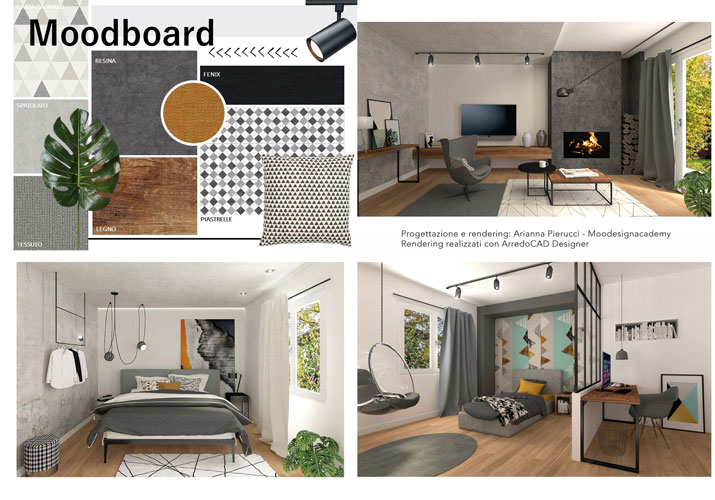
The 3D interior design software ArredoCAD allows you to virtually reproduce the “picturesque atmosphere” for every room of your house, recreating the nuances of the walls, the insertions and of any other particularity you would like to enhance.
The program helps to materialize ideas, transforming them into a real images where you can test different colors and combinations until the final results are satisfying and the final comment an astonished 'wow'. A useful project overview that can help made the right choices and give complete harmony to your home, avoiding color mismatching and energy flowing interruptions.
The final rendering with the visualization of the completely furnished rooms and colors, the final decision regarding the exact code of the Pantone’s color or the right paint nuance to buy without risking of having unpleasant surprises: ArredoCAD, the interior design software of choice.