
The Pantone Color Institute is an American Academy. Since 2000 it has been forecasting color trends that have an impact on fashion, graphics, and partly also on interior design. The Pantone Color of The Year can influence product development and packaging and, in terms of interior design, the choice of household linens, textiles and accessories.
Like every year, Pantone has announced the trending color for 2021, but there is something new: a color matching made up of by two hues, Ultimate Grey 17-5104 and Illuminating Yellow 13- 0647, a neutral grey and a desaturated yellow.
The symbolic character of the 2021 Pantone color
The choice of the Pantone Color of the Year 2021 is made up of two colors that symbolically represent the harmonious solidity of grey echoing the pebbles in a brook and the vital energy of yellow representing sun and light.
After a year marked by uncertainty and anxiety due to the long and difficult period of the pandemic, the choice of Pantone expresses the wish for hope and positive feelings. With this choice, Pantone wishes to send a message of strength and light, hope and solidity. These two colors, inspiring feelings of stability and concreteness, leads us to consider new scenarios, new thoughts and new actions.
Moodesignacademy recommends
To Interior Designers and Furnishers who read our blog, Moodesignacademy recommends considering the two trend colors chosen by Pantone for 2021, Ultimate grey and illuminating yellow, as symbolic. This is to avoid misunderstandings on the use of the colors, following design trends that do not follow marketing and communications trends.
Interior design trends do not move as fast as fashion trends, because interior design is based on long term research that can take a few years – usually seven. Fashion trends follow the seasons, and what is trendy this year will not be trendy next year. Regarding this Vico Magistretti, an Italian architect and designer, said “… While fashion trends are always changing, quality design is long lasting”.
The right approach
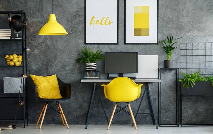
It would be a big mistake if we, the interior designers, were to propose to our clients, for this year, a charcoal grey sofa with pollen yellow cushions in a background of dove grey painted walls with taxi yellow shelves, all matched to fabrics, textiles and wallpapers using only these two colours!
Let us imagine for example that one has the opportunity to furnish a small apartment in the historic centre of Milan, in an Art Nouveau-style building of the early 20th Century. It would be absurd to use these two colors in an apartment like this. My words are a provocation because before writing this article I researched the sites of many experienced design bloggers who were advising how to use yellow and grey in home interiors in order to be trendy and successful in the new year … I would say that this advice is completely inappropriate!
I have never really thought that an interior design project should start by choosing colors.The use of color in interior design should be seen as a suggestion that follows a precise style and therefore creates a specific mood. My suggestion is to always research and define a design style and genius loci, essential elements to create a successful project.
Interesting information about yellow
Nowadays the communications media play a vital role when it comes to finding information about how to use colors. In first place strategies related to visual design and marketing can influence the way people perceive and acquire a consumer product for everyday use.
Producing an object, creating a symbol or a brand, this is how a social imaginaryrelated to colors can be created. A color that characterizes a specific product may not only contribute to it becoming popular, but could also influence consumers to purchase it.
What yellow stands for in terms of marketing
In order to understand what yellow stands for in terms of marketing, we could make a list of all popular yellow objects that influence our way of looking at things. For example: do you remember the pencil we all had in our school pencil case and that we had to sharpen continuously in order to write clearly? You will also remember its particular shade of yellow along the shaft and its red tip with the eraser. It seems that yellow was the chosen color because graphite came from the East: the choice to use yellow on the wood covering it was a tribute to respect and thankfulness which is the significance of this color in China.
And how about the Yellow pages? They were yellow because when they were invented only this type of paper was available.
Have you ever thought about the trademarks of famous international groups like Ikea, Ryanair or Eurospin? They have yellow and blue logos because in marketing communication, these two colors represent inexpensive products, affordable for many consumers and thus convenient.
Do you know that …?
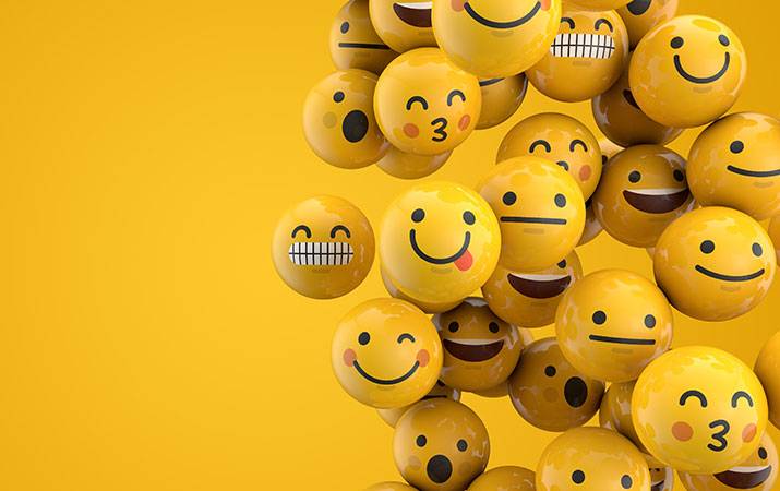
The iconic packaging of Nesquik for cocoa powder uses a cartoon bunny. The businessman Harry N. Allen decided to paint his New York cabs yellow so that they were more visible at a distance and would be hailed before those of the competition, which were white. Another example can be found on office desks everywhere: Post-it Notes were created solve the problem of ineffective adhesive and they were made a distinctive yellow color to be more visible. Mobile phone emoticons reproduce the original small yellow smilies and tennis balls, that used to be white, became yellow in order to be more visible on TV screens …
Yellow has an important symbolic meaning. In the East, for example, it is associated with royalty, often turning into gold and becoming the color of the Emperor. In ancient times, mad people wore yellow clothes to be recognized more easily. In the Middle Ages yellow symbolized falsehood because it was perceived as being a degeneration of the quality of gold. In the medieval paintings of Giotto, Judas’ cloak is yellow because it was considered to be the color of a traitor. In classical iconography instead, the cloaks of Jesus or the Madonna are blue, a color that was created using a powdered rare and expensive precious stone, lapis lazuli.
*The harmony of grey
In color theory, experts define grey as an achromatic (or neutral) color because it is a mixture of black and white, which are also defined as non-colors. Instead for artists, stylists, graphic designers and architects, grey has multiple purposes, above all in order to create harmony and balance, as a sort of respite between components of opposing hues.
Photographers, painters and for those working in the graphic sector, it is probably the essential color that allows for the creation of plays of light and vibrations, so much so that black and white photos are enjoying a revival again.
In terms of marketing and in the packaging sector in particular, grey is to be avoided because grey products are not eye-catching, they do not create empathy and they are not pleasing for consumers.
The importance of grey in the interior design sector
If dull and somber tones are commonly perceived as being sad, melancholic, depressing, for architects and those who work in the interior design sector, grey is essential as it indispensable in the creation of relaxing, elegant and contemplative surroundings. According to color theory, grey is achieved by adding white to varieties of black. In interior design, we can never think of color in terms of an abstract concept, but always associated to amaterial and therefore to a texture, and I would add, to a mood. Grey for a fabric for a classic design, it will probably be different from a grey used for an industrial or minimal design. Firstly then, it is necessary to describe any color, grey in this case, using a defining word that makes it positive, to help those who are listening, to describe it according to a specific tone or tint.
Grey hues
Saying “grey” for example, means nothing… as professional interior designers we should define this color using other words like cloud grey, cement grey, anthracite grey, traffic grey, gunmetal grey, plumb grey, platinum grey, and I could go on and on!
Greige, for example, is the extraordinary combination created by Giorgio Armani who mixed beige with grey obtaining what today we know as dove grey.
Optimizing color management with ArredoCAD
Using 3D graphic software specific for interior design like ArredoCADcan be very helpful in order to become a successful interior designer. Thanks to a vast color library and the possibility of importing them from outside the program, ArredoCAD allows the fast preview of experimentation and 3D visualization of any kind of solution, color matching or color variation, giving a realistic view of the final outcome.
This allows interior designers to constantly check the coherence and impact of their choices helping the end customers – who may not be too familiar with color samples – to appreciate the proposed solutionsin terms of functionality and aesthetics. An ideal way to avoid unpleasant surprises and regrets at the end of the project.
di MARTA PAGANOTTO
Art Director - Moodesignacademy, Verona
and teacher of Interior Design training courses